Thursday, 27 February 2014

Estella makeup designs

1.


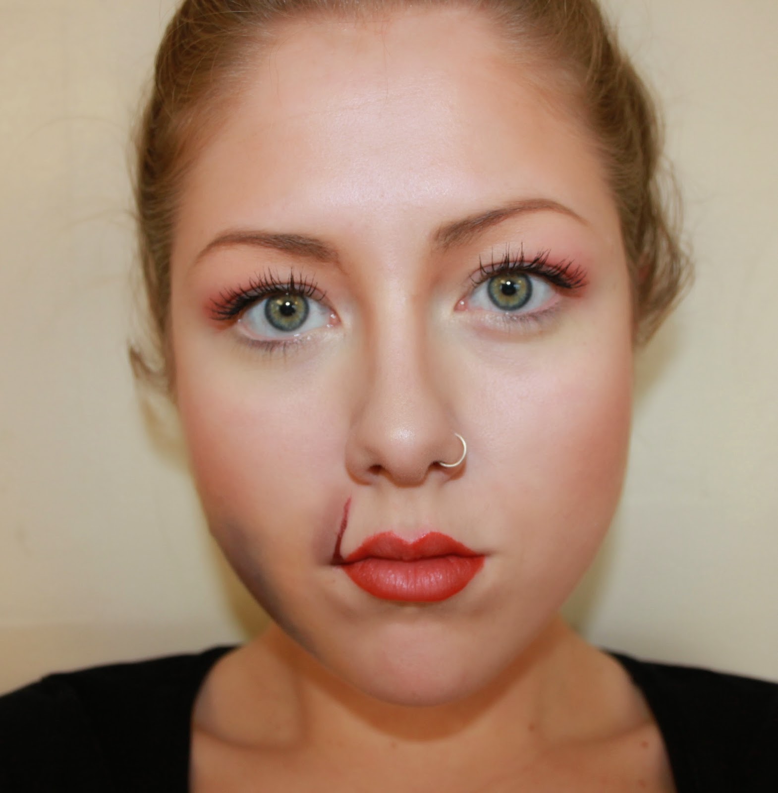
This look shows the contrast between beauty and pain. Estella was trapped in an abusive marriage, so I wanted to portray some of the damage it had on her. The look shows bruising to her jaw and a cut to the lips. This is to show that she may have got beaten by her husband. The rest of the makeup is to portray her beauty, as if the makeup is covering any pain under the surface. The eyelids have a hint of red to suggest sore eyes from crying. The skin is contoured and flawless to suggest that she has no flaws and has a perfect beauty.

2.


This look involves paler skin with pink tones. This would be suitable for a fairer complexion. The pink is soft and natural. In the Victorian era, it was considered that a natural look was more attractive and fashionable. The lips have an ombre gradient and the eyes have a flick of eyeliner to make the look feminine.

3.


This look heavily focuses on the lips which are a scarlet red with gloss. The skin is softly contoured with a slightly pink flushed cheek to make the look (apart from the lips) appear very natural. I have used pale colours on the eyelashes and brows to make the look very subtle.

4.


This look is a bit bolder, which I felt reflected Estella’s personality very well. Her lips are a striking red which alarms danger. The eyebrows are harsh and defined to create a strong expression and the skin is contoured to define the bone structure. The eyes have a bold flick and layers of mascara on the upper eyelashes to create a beautiful feminine look. To me, the look is perfect for Estella, but the flicks are possibly too contemporary.

Final Estella makeup look:


This final look is highly influenced by the look from before. The skin is flawless, contoured and has a hint of blush for a beautiful finish. The lips are dangerous and devilish, just like Estella’s femme fatale character. The brows are striking and very bold with a softened gradient towards the centre. To make the look more periodic, I have left the eyes without eyeliner and just a simple bit of mascara and nude shades on the eyelids. The look has a softness about it with striking characteristics, just like Estella. 

Estella hair designs


For the perfect Estella hairstyle, I imagine the hair to be very slick, shiny and away from the face. This would represent her cold personality. The hair would also have to portray a sense of femininity and beauty, so I feel that some intricate detail would be necessary. I would like to keep the look fairly simple, neat and glossy as I feel it will capture the femme fatale characteristic of Estella.

1.
For this look, I have decided to create height off the forehead in a slight heart shape. The finish is sleek and glossy and kept very simple. The sides are scraped back which create a harsher look to the face. At the back, there is a simple bun with and intricate plait around it. I feel that the detail was necessary. The loosely curled hair at the back makes it feel more periodic and adds a touch of femininity to the look.


2.
This look has been inspired by one of the images from the previous post. What I like about this look is that the hair is completely scraped back off the face and taken into a massive detailed and sectioned bun. There is a donut bun in the middle surrounded by sections of hair curled under to create a flower-like effect. The transition from the slicked hair to the bun is tidily covered by a plait which surrounds the bun.


3. 
This look has again been given height in the form of a traditional quiff. This then leads into a very neat french pleat at the back. At the bottom, two strands of curled hair have been left to emphasise a feminine effect. What I particularly like about the look is the slicked back sides and heightened top as it creates a really definite and striking look. It also allows the makeup to be a key feature to Estella’s look.


4.
This look has a very traditional twist with the mass of hair, use of plaits, a bun and a definite centre parting. The centre parting creates a harsh line which would be glossy and neatly brought to the sides. The hair at the back is slicked back into a tight and very neat bun. The plait surrounding the bun would be extensions that have already been plaited and attached using pins. To this look, I have added small bits of detail with crystals in the plait. This creates a regal and wealthy element which is exactly what Estella’s life was about.


5.
For this look, I wanted to try something slightly different and possibly not quite traditional to the Victorian era. For this look I decided to section off some of the front hair to twist round into a perfectly neat and glossy pincurl. The front has a quiff effect and still follows my theme of being off the face. At the back, there is again a neat french pleat. I enjoy using the french pleat for Estella’s look as it is precise and feminine. Two curled strands of hair have been left out again for the same reasons.


6.
This look to me is very Estella. It’s quite extravagant with the fact they're is height and width to it. The large and wide quiff at the top is sleek and dramatic. At the back there is a sectioned bun, which is a bit more interesting than a regular bun. Unfortunately I didn’t quite achieve the scale I was intending because of the lack of hair. To create such mass, extensions would be necessary.


7.
This look was one of my favourites. I really wanted to have a design that incorporated a slick centre parting off the face in all angles. Rather that using a quiff for height, I have decided to used an oversized plaint. Then at the back, two strands of curled hair to follow the traditional look. The plait would be created with hair extensions to add volume. This would be plaited then curled under and fixed into place. I have also added some detail at the front by using jewellery to make the look more expensive and higher classed.


The Final Estella Hairstyle:

This is the design I wish to use for my final look for Estella. I have based this upon the previous design with the concept of a slicked back centre parting with a plait ontop to create dramatic height. After practising the previous look by tucking the plait under, I came to the conclusion that it would simply not work if I was to use the existing hair extensions that I own. So instead, I have decided that I will take advantage of the length the extensions will give me and use the plait on its side and bring round the the front and back and secure into place. I also felt that the two loose strands of hair softened the look and I wanted it to look sharper and cleaner.


Sections of hair to attach extensions:

This diagram shows how i would section the hair. The sections are to be tied with a ponytail and made sure that they blend in well with each other and produce a definite sleek shine with no fly away hairs. In these sections, the individual extensions will be attached using clips and then plaited together to ensure the natural hair is neatly incorporated with the extensions.

Burns, Deep Cuts, Scratches, Creating + Applying Moulds

Equipment:

·      Tissue
·      Supracolour palette
·      Spirit gum
·      Pin
·      Hair dryer
·      Brushes
·      Gelatine
·      Fake puss

Instructions:

·      Rip up thin sheets of tissue paper and layer onto skin using spirit gum and an old brush.
·      Layer and wrinkle up the tissue to create texture.
·      Create rips to make the skin appear broken using a pin.
·      Dry using a cool hair dryer.
·      Add colour to the tissue from the supracolour palette using a brush and blend with fingers.
·      To create an even more realistic effect, use gelatine warmed up in the microwave.
·      Warm up by placing in a bowl of cool water and heating for approximately 60 seconds.
·      The gelatine comes in various colours, but the can also be mixed for a more desired colour.
·      Apply the gelatine to create a shine effect of the flesh or a wet look blood.

·      Add fake puss to wounds.


Deep Cuts and Scratches


Equipment:

    Collodium
    Tuplast
    Fixer Spray
    Derma Shield
    Grease paints/bruise wheel
    Cotton pad
    Fake blood

Deep Cuts:

      Start by applying derma shield to the desired area to protect the skin from the collodium, as it is very alcoholic.
      Then apply the collodum to the area where you want the cut to be, making sure to work fast as it drys quick.
      Squeeze the lip together to create a deep cut appearance.
      Dry with a cool hair dryer.
      Use a mixture of colour from the Kryolan bruise wheel to create the colouring effect of a cut.

Scratches:

      Apply lines of tuplast where you want the marks to be.
      Apply a small amount of powder to take the shine away using a cotton pad.
      Apply a small amount of colour ontop using a dabbing technique, blend in.

      For a fresh cut effect, just add blood!


Creating & Applying Moulds

Equipment:

·      Mould
·      Vaseline
·      Gelglyk
·      Latex
·      Loose powder
·      Soft brush
·      Pin
·      Prosaide
·      Cotton bud
·      Grease colour palette
·      Fake blood

To create:

·      Put vaseline in the mould before to help removal.
·      Apply the Gelglyk or latex in moulds (Gelatine is quicker to use as it will set in up to a few hours). Be wary of air bubbles in the moulds.

To get out of the mould:

·      Use a pin to lift the edges.
·      Powder a soft brush and gently lift the mould away.
·      When the mould has been removed, powder both sides to stop it sticking.

Applying to skin:

·      Clean area of skin.
·      Apply prosaide to latex mould using a cotton bud.
·      Allow the prosaide to go tacky and apply to the skin.
·      Roll edges into the skin with a cotton bud. Blend in the edges with warm water to melt the latex/gelglyk
·      Apply colour using a grease colour palette andbrush. Blend with fingers.
·      Apply blood to the inner part of the wound.