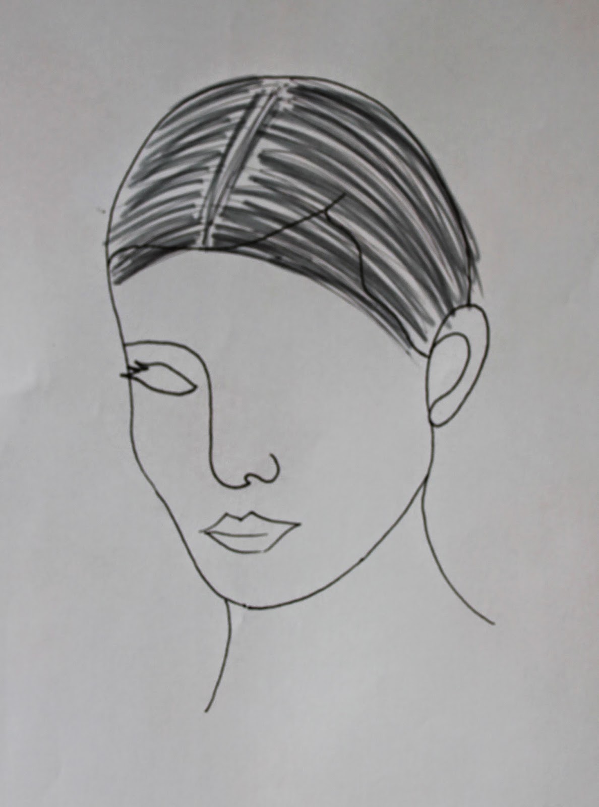
Makeup Designs:
1.
This first Quentin design is fairly simple
but makes a statement. The colours create the impression of quite a strong
character. The lips are dark and bold and quite unusual for a male character as
the lips aren’t necessarily usually a feature of the main focus. The eyes have
a mask-like effect with pale powdered red across them. This could also
represent something that Quentin is hiding behind in fear, or possible red to
represent danger or in danger. I like this design because the eye mask makes
him look a bit like a super hero, which could contrast Claudia’s villain role.
But I feel that the lips were too much so I would like to verge away from this
being the focus.
2.
This look is very, very dark and has an
Adam’s Family feel about it. The contouring is heavily created in black to
hollow out the pale face making it look like a skeleton. There is a very heavy
focus around the eyes and eyebrows making him look quite deathly. The sides are
where I have extended the hair in a geometric shape to accentuate the hair line
to create structure. The lips have a slight pinched effect in dark red. I feel
that this look may be too heavy for Quentin.
3.
This look is simple but effective with the
eyes heavily darkened to make it look mysterious. The rest of the face is left pale
and flawless with no colour on the lips or cheeks. The eyes are fully blackened
to make his identity uncertain as the eyes are a strong feature of the face
that defines you. I have blurred out this part of Quentin’s identity because Quentin is imaginary and often changes in Claudia’s imagination.
4.
With this look, I have created a very strong
brow which creates an angry expression. They are dark and heavy and create the
main focus of the look. The eyes are darkened around the edges too. The face is
then lightly contoured with black powder to make the bone structure more
prominent and to make Quentin more handsome. I feel that the eyebrows may look
too angry rather than the vulnerable look which is what I am after instead.
5.
I have chosen this look for Quentin as I
feel it captures darkness and slight vulnerability in one. The face has the
effect of being hollowed out with use of strong contouring with black at the
cheekbones, nose and temples. The base is paler than normal to create a gothic
look. The eyebrows are bold and quite similar to Claudia’s as I’d like the two
looks to work together nicely in the music video. Again, strong eyebrows are on
trend, so they are a main focus for this look. The eyes are darkened and blend
out softly. The lips have a deep red pinch in the centre which make the lips
look smaller and don’t draw too much attention away from the eyes. Alongside
this look, I will be using rope to tie up Quentin to suggest how Claudia is in
full power of their relationship. This is not in a cruel way, but in a psycho
and obsessive manner.
Hair Designs:
1.
This hairstyle is very slick, prim and
proper. There is a high shine on the hair, which would be created using mousse,
shine spray and heat applied through use of a hairdryer. The style is
understated and kept simple not to draw attention away from the face.
2.
This design has a sharp side parting with
one side pulled forward and slicked over half of the face. This look creates
mystery and makes Quentin seem shy. The hair will be kept slick with the use of
the techniques as above.
3.
This look is quite wild and out of control
but has a sense of innocence to it. The hair looks youthful, full and quite
cute with all the random curls, which are separated into a side parting. I like
the concept of Quentin looking innocent, but I feel it doesn’t seem dark enough
and doesn’t look suited to Claudia’s look.
4.
This design has the modern short back and
sides style with a defined sideburn created with coloured spray. The quiff is soft and left
a bit untamed. This would be created by applying heat to the roots to create
lift and then fixed using hairspray. The look is nice, but not striking or dark
enough for the look I’m after.
5.
After choosing my fantastic model, who has
their hair cut into a mohican, I decided that I will use this to my advantage.
I am going to use the hair in the centre to elongate the face by creating an
upward volume which is sleek and slicked into a quiff going all the way down to
the back of the neck. To create this, mousse will be applied whilst applying
heat to create lift at the roots. The hair will then be set into large backward
curls, once cool they will be brushed back to combine together. Shine spray
will be applied to create a polished finish. This look is ideal as it is simple
and with an edge, which I feel will suit Claudia’s look and the theme of the
music video I have in mind.


No comments:
Post a Comment