Makeup Designs:
1.
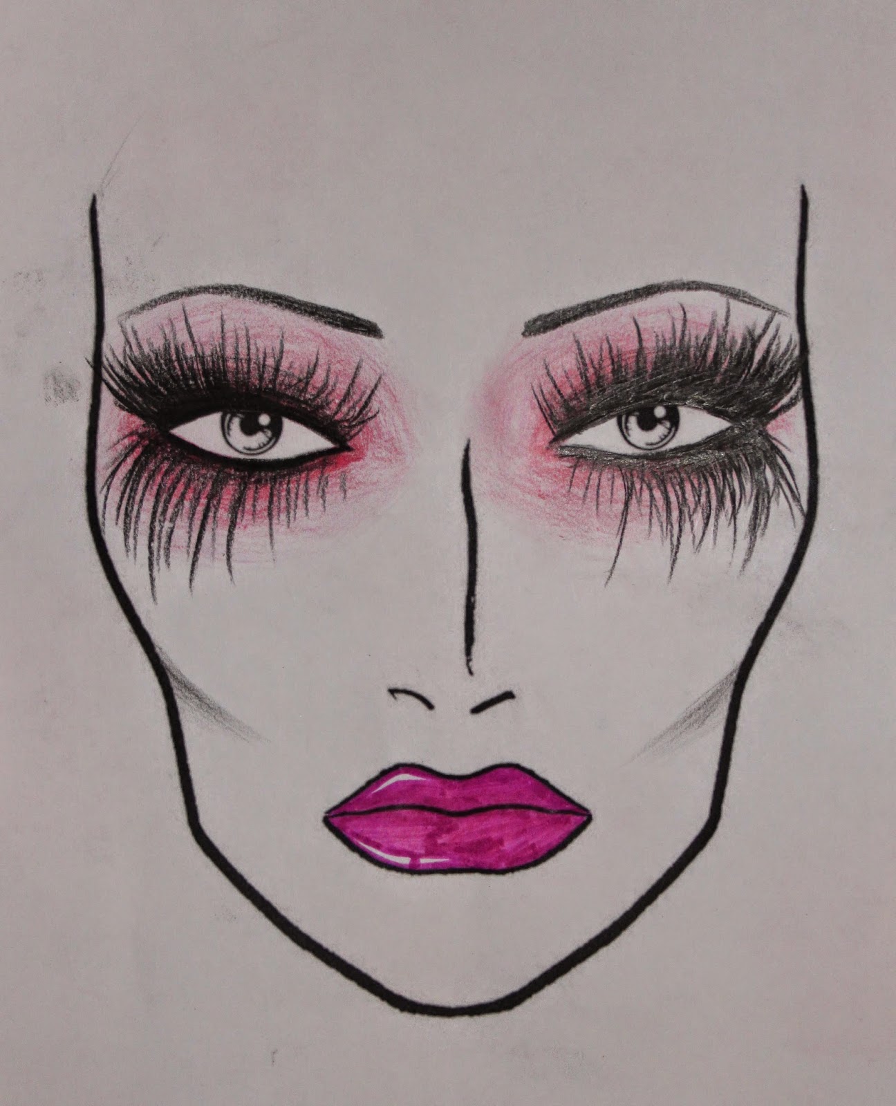
For this look, I am focusing on creepy yet
feminine. With the main colour being pink and lines to create the illusion of
long eyelashes, you would think it all sounds very pretty. Instead, it looks
psychotic and insane. The contouring makes the face more defined and the pale
skin tone looks ghostly. The bright glossy lips look entising, which emphasises
the femme fatale concept. The eyebrows are thin and look overplucked and
creepy. This look screams Halloween rather than fashion horror, which isnt
really what Im after. Im after something current that has a hint of sexiness.
2.
For this look I wanted to try something
futuristic and minimal lash detail around the eyes. This is definitely a
different approach to the first look I tried as I wanted to test different
possible themes. For this look I used Katy Perry’s E.T music video as
inspiration. It slightly diverges off the gothic horror theme that Claudia
would have gained from horror films, but aliens are scary right?! The eyebrows
are higher than naturally positioned and create an angry expression. Even
though this look had potential, I feel that it’s possibly too far off the
concept I am aiming for and would like something a little more gothic.
3.
This look shows elements of beauty with the
contouring of the cheekbones, shaping of the eyes and mascara on the eyelashes.
In this, I have decided to stick with dark shades but wanted to incorporate
some colour and therefore I chose to use purple. The look is striking which
creates a dominant feel from the bold lips and eyebrows. This look was inspired
by the evil queen from Disney films, but the fact that it’s inspired by Disney
may be enough to suggest that this look isn’t ideal for my idea of Claudia.
4.
With this look I have again chosen to focus
on the illusion of large lashes and would possibly create my own lashes to
create this effect in 3D. This lips are larger than the natural lip shape to
create an emphasised and oversized lip. The eyes and lips together make a
statement and create emphasis on the most feminine features of the face. The
blue lips make the look more fashion forward and current. The look isnt quite
how I would picture Claudia as I feel it is too eccentric.
5.
Focusing heavily on the eyebrows with this
look, I wanted to create a large impact. The design almost reminds be of
antlers which are often associated with stags which are very dominant, as they
use their antlers as a weapon to be the alpha male. I kind of like this idea as
it represents how Claudia is the dominant in her relationship with Quentin. I’ve
added a soft feline flick on the eyes to make her look more feminine, not to
draw away from her gender despite her role. The lips have an ombre/reversed
pinched effect which is softer than a full lip.
6.
With this design I wanted to go with something
that is very harsh and evil looking. The strongly angled eyebrows create an
instant aggressive expression and the spikes on the lower lip look dangerous
and fearful. This is how I’d expect Quentin to view Claudia. Rather than being
a ‘villain’ here, I feel that Claudia represents more of a monster as the
spikes slightly remind me of sharp teeth. This design has been inspired by the
film ‘Jaws’ as I feel she looks shark-like, with the angle of the brows and the
red blood thirsty lips.
6.
Here, I have chosen a typical female
vampire look with the detail on the forehead. The contouring is striking
against the pale skin, to create a harsh and defined bone structure. The eyes
are sultry and feminine, but the eyebrows are bold and defined. I can see
Claudia with this look and Quentin is the victim she will suck blood from. The
lips are heavily glossed and red which reminds me of blood and makes the look a
little bit gory. Although I really like this look, I feel that Claudia should
be her own character and not developed from an existing character.
6


I have chosen this design as my final look. I feel it takes aspects from
some of my other looks to create something which is soft horror. I imagine
Claudia to be very much in love with Quentin, so she isn't going to want to kill
him, she is just dominant over him and maybe is a little too in love, in the
sense she is obsessive! With this idea in mind, I imagine Claudia would want to
feel attractive in front of Quentin and therefore she would like to make herself
more appealing rather than horrifying. So the makeup look I have gone for is dark, yet seductive and
feminine. The eyes are dark and smokey, with emphasis on fluttering lashes.
With the contouring, I intend to make the face shaped in a flattering way, which
highlights her bone structure. Bearing in mind current trends with makeup, I
have opted for the ‘power brow’ and heavily applied black to create a bold
structured set of eyebrows. The lips are scarlet red which oozes sexiness and the gloss makes it
that little bit more horror. I can imagine this look being inspired from horror
films as the femme fatale character, who entices her victims, but isn’t too over
the top. I have opted for subtlety with this look, Claudia’s and Quentin’s
relationship in mind, as I don’t want her to be portrayed as the villain, just
slightly evil instead!
Hair Designs:
1.
For this look, I have chosen to create a harsh slicked back ponytail. The hair is scraped off away from the face to create a harsh effect by pulling the skin back. The hair is very sleek and perfect, with aid of mousse, hairspray and shine spray. The securing of the ponytail is hidden by a strand of hair wrapped around. The ponytail has height and volume, but finishes in a sharp point.
2.
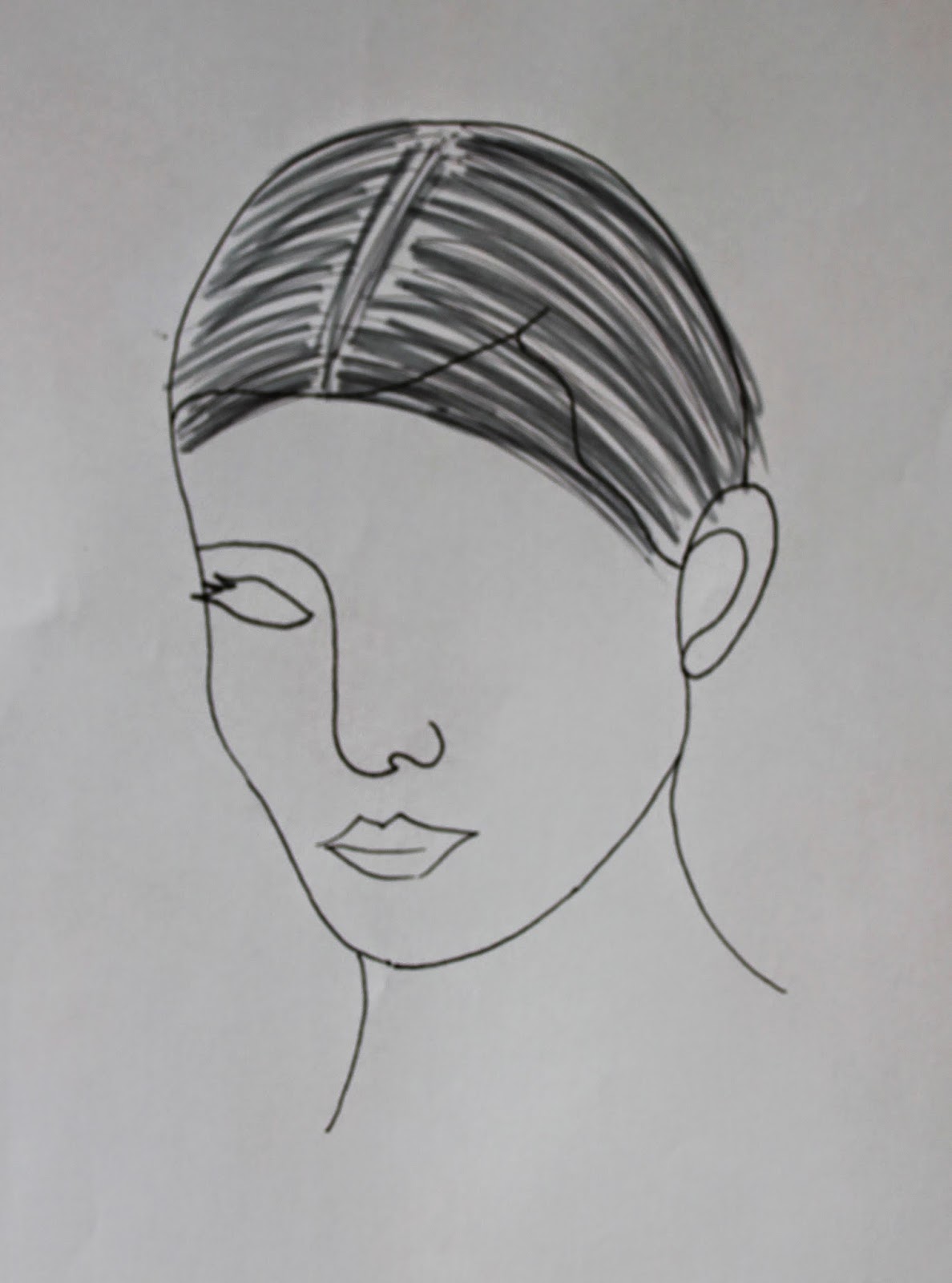
This look has contrasting textures, metaphorical for Claudia's personality. The sleek centre parting is smooth and suggests a calmer and more refined personality. The backcombed ends suggest her crazy and out of control personality. The hair looks like a lion's mane, which suggests her dominance and control, being the leader of the relationship. The top section will be created using heat and mousse, then tightly secured behind the ears. The rest of the hair will then be back combed and heavily textured to create volume.
3.
This look has been inspired by Lara Croft from Tomb Raider. The hair is harshly and tightly braided along the scalp into a centre parting, which is pulling the skin back on the face, to create a harsh facial expression. The ends of the braids are then sectioned off and plaited into three. Again, the hair would be slick and neat using mousse.
4.
This is my chosen look for Claudia's hair. The hair has been put into three sections, the top section being a braid starting from the hair line, working backwards away from the face. The hair is slick and smoothed out using heat. The braided section has mousse applied to avoid fly away hairs and to neaten the look. This look is developed from the braided look, combined with a vampire inspired look. I want the hair to look simplistic and sexually attractive. I feel that there is a reoccurring trend in music videos where the main female characters are usually very attractive. Therefore, I want to portray this with Claudia as a Femme Fatale.


